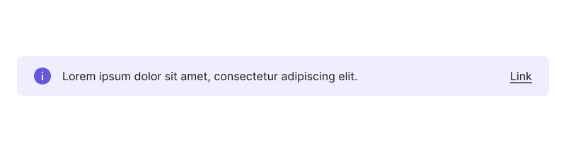
Info Card
A contextual message component that provides helpful information, warnings, or guidance related to nearby content or actions, with support for multiple severity levels and optional CTAs.
Purpose
An InfoCard is a contextual message that provides helpful information, warnings, or guidance near a related element before a user takes action. In overlays like modals and side modals, it may also appear after the action. InfoCard takes the width of its container and displays information with semantic color-coding to indicate the type of message.
Unlike Banner (which affects the entire app or page) or Snackbar (which provides feedback after an action), InfoCard delivers context and guidance specific to a section, field, or action.
Preview
When to use
- To inform users about the potential consequences of an action
- To provide necessary context about a field, section, or action
- To highlight important but non-critical issues
- When you need to present key information clearly with an optional CTA for additional details
- To deliver contextual help or guidance within a specific workflow
When not to use
- Don't use for post-action feedback - Use Snackbar instead
- Exception: ModalDialog and SideModal contexts where InfoCard can appear after an action
- Don't use for app/page-level messages - Use Banner when the message affects the entire app or page
- Don't use when acknowledgment is required - Use ModalDialog when the user must acknowledge the message before continuing
- Don't use CTAs for immediate actions - InfoCards deliver context and information; avoid placing CTAs for immediate actions within the component