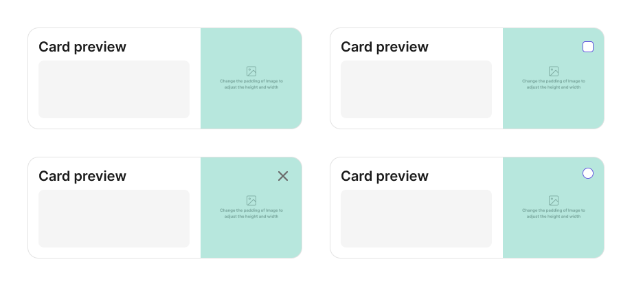
Card
A versatile container component that groups related content and actions, supporting multiple interaction patterns including clickable, selectable, and custom configurations.
Purpose
Cards are flexible containers designed to group related content and actions about a single subject. They provide a structured, scannable way to present information with support for various interaction patterns including navigation, selection (single or multiple), and custom behaviors. Cards can display content in different orientations and support special variants like AI cards and Tip cards.
Preview
When to use
- To group related content and actions in a contained, scannable format
- When you need clickable containers that navigate to detail pages
- For selection interfaces where users choose one or multiple items
- To create dashboards, galleries, or grid layouts of similar items
- When presenting content that benefits from visual hierarchy and clear boundaries
- For specialized UI patterns like AI-powered features or informational tips
When not to use
- Don't use a Card when content should flow naturally within the page layout
- Don't use for single, isolated pieces of information - use appropriate typography instead
- Don't nest Cards too deeply - it creates visual complexity and reduces scannability
- Don't use Cards for primary navigation - use Menu or NavigationBar instead
- Don't use when you need alert-style temporary notifications - use Snackbar or Alert